Motion is critical for how a product feels. It guides attention, reinforces brand personality, and can make an interface feel more responsive. Motion has been a core part of my design process, going way back to the days when Principle was king.
Here’s my general framework that I’ve been using over the years.
When in doubt, use ease out
Ease-out curves are the safest choice in product design. They start fast and slow into place, creating a snappy feel that works in most cases.
Perception of speed
Fast-feeling interactions make products feel more snappy and performant. A good default for most UI animations is around 300ms, but the end timing usually comes down to the animation curve as well.
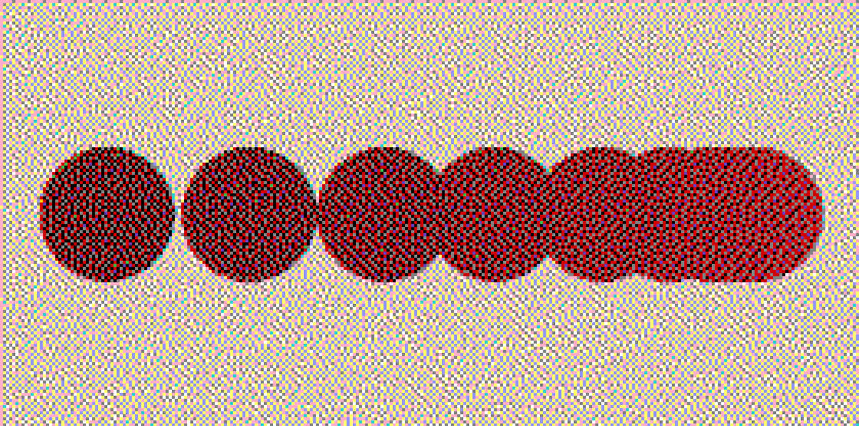
Match timing to the object size
Small elements should move quickly. Large elements need more time to avoid feeling abrupt. Bigger objects = slower motion, just like in the real world.
Use faster exits than entries
Closing a modal or dismissing an element often feels better when it’s slightly faster than the entry animation. It doesn’t need to have a crazy difference, but these little details can go a long way.
Own your animation curves
Experiment beyond relying on Figma’s default curves. Custom bezier or spring values help define the feel of your brand, especially when they are consistently used across platforms or experiences.
Start with three timings
Quick, default, and long. This creates a simple framework that can be used in most use-cases, then you can refine when custom timings are needed.
Embrace springs
I hear a common misconception of people not using spring animations because they don’t want things to feel “bouncy”. Spring animations don’t have to bounce. They mimic physics and are ideal for drag or flick interactions because they can be interrupted mid-motion.
Springs are the default on iOS, rarely bounce (except for smaller moments like in the dynamic island), and feel great in use.
Try motion libraries
Libraries like GSAP or Motion add some extra horse power beyond basic CSS animations. They enable features like springs, damping and stagger animations while keeping animations performant.
Get out of Figma
Figma is fine for static design, but limited for motion. Without precise timelines, choreographing interactions is clunky, and handoff is messy. Tools like Protopie, Origami, or Play, handle complex animations far better, and unlock more possibilities.
Don’t overdo it
Animation should serve a purpose: guide attention, add delight, or improve navigation clarity. Too much becomes distracting, and it’s easy to fall into the trap of sprinkling it around everywhere (I’ve been guilty of this).
Opacity and transform are key
These two properties are the foundation of smooth, performant animations. Scaling from 0.5 to 1 with a 0% to 100% opacity at the same time is a versatile and graceful motion pattern that can be used in a surprising amount of places.
3 Comments
Great advice all around!
Appreciate it!
Thanx