One thing that I’ve discovered about starting these monthly summaries is that they really highlight how fast months pass by. It feels like yesterday that I wrote the February summary.
That said, the Mediumrare rebrand is going well, and last night, I got my first glimpse at some of the design concepts. Things are looking pretty good so far, and while it might not completely match my personal style, I’m going to roll with it and see how much it grows on me. We think it should be live by the end of the month, but it really comes down to me supplying enough case study work to tell a compelling story.
This is the 19th year of Mediumrare, and I’m finding it difficult to pick a niche/focus for the business. I design a lot of websites, have a deep understanding of iOS product design, and also have enterprise leadership experience building design systems. I don’t want to water down my offering, so I need to decide which one to lead with.
I’m slowly but surely starting to fill out the townhouse with a few more pieces, and I’m super happy to have finally found some suitable items for the loft reading area. It took a surprising amount of time to find a classic piece that was not only comfortable but fit the small space without it being overwhelming.
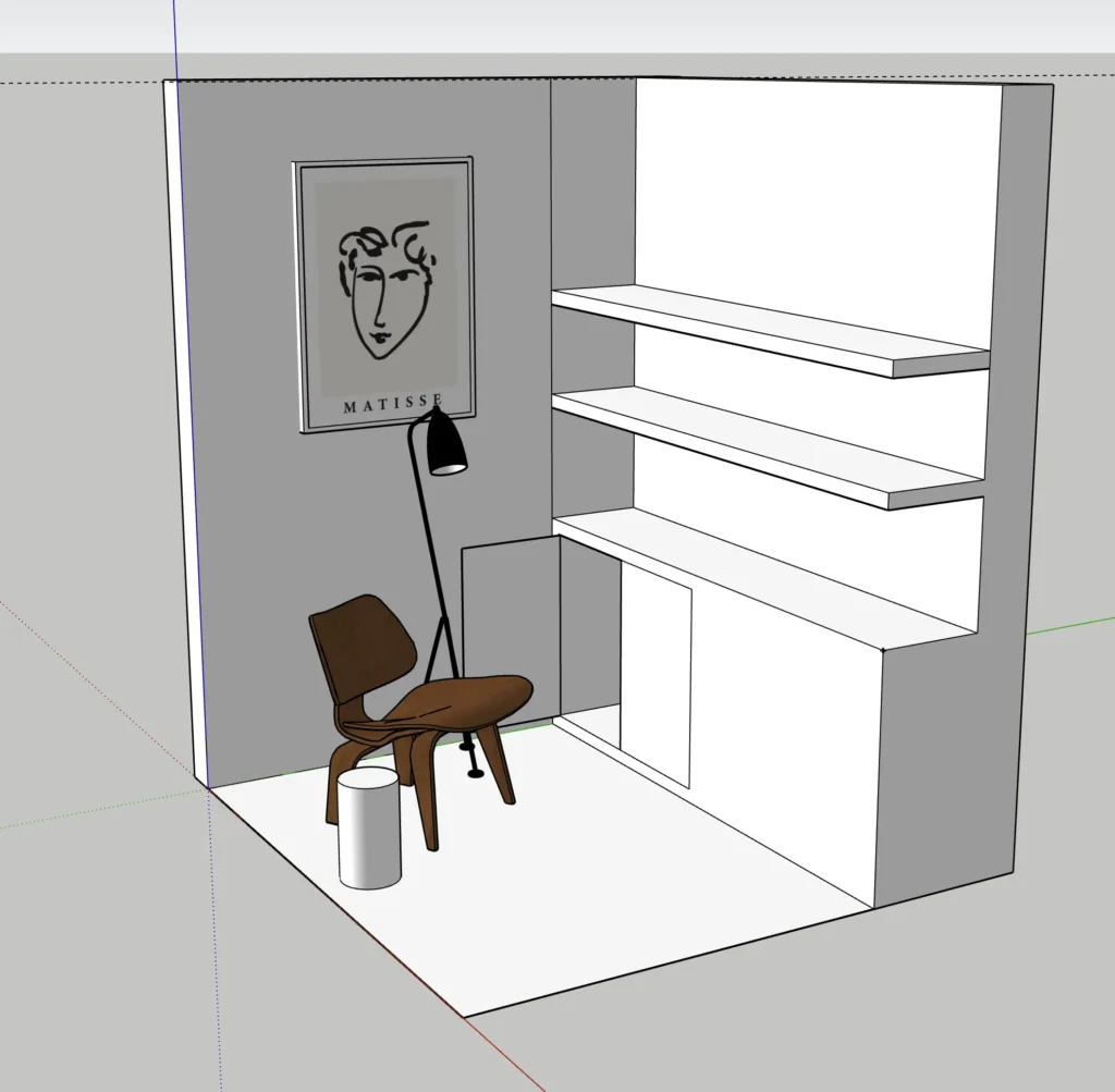
To start, I measured the space, made a simple SketchUp model, and then brought in some classic furniture to get a sense of scale. This was a huge help in envisioning the space before committing to buying something.
I ended up picking up an Eames LCW, a Vitra cork stool (Model D), and a Menu Carrie lamp. I was originally going to get a floor lamp, but the outlet is in a weird spot, and the power cable would be annoyingly visible.
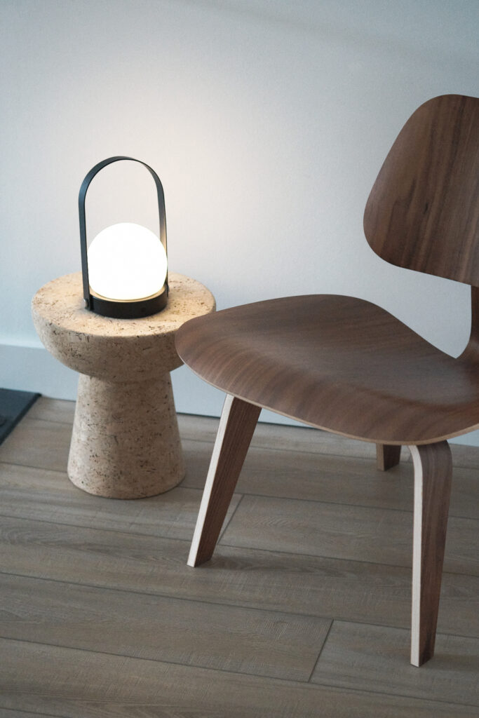
I’m surprised that the LCW doesn’t have rubber feet, which makes it slide around every time I sit down. I’m trying to find a circular rug I can put under both, but the size isn’t very common, so the hunt is going on a bit longer than I’d like.
I’ve also been on the hunt for a few pieces of artwork and picked up a few unique things this week. First up, is this new old stock Massimo Vignelli calendar designed for Knoll in 1972. This beauty has been sitting in its original packaging since then, so I’m happy to give it a little home on the wall.
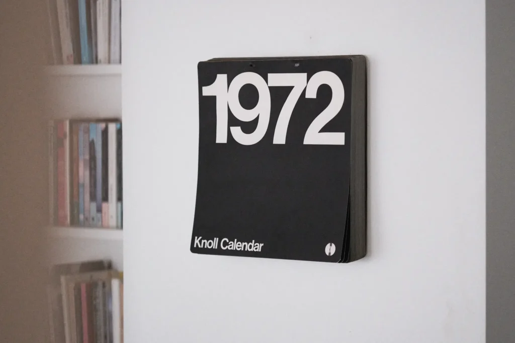
I love sprinkling these kinds of pieces throughout our space. Something uncommon, but with a history.
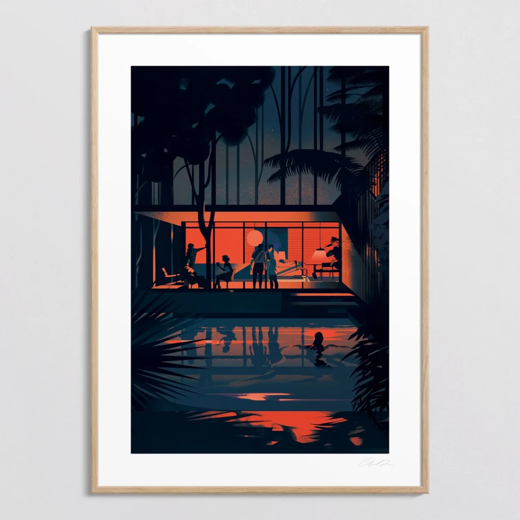
On the other hand, I picked up a new piece from illustrator Charlie Davis for above the Eames chair. I love the moody vibe of this illustration, and I think it pairs perfectly with the mid-century vibe.
What I’ve been watching
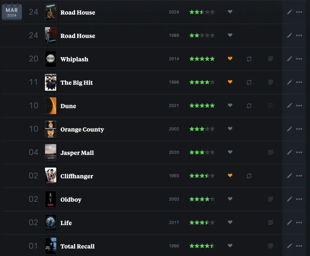
I watched way more movies than I usually would, but most of them were things I’d already seen, playing in the background during gym sessions. A few new standouts included Oldboy (holy shit) and Life.
I’ve also been binge-watching the Drumeo YouTube channel after discovering a series in which a well-known drummer creates their own drum part to a song they haven’t heard before. I don’t even play drums, but something about this is so satisfying to watch.
What I’ve been playing
Baldurs Gate 3

I finally bit the bullet and picked up Baldurs Gate 3, and I have been loving it. Each character is deeply interesting, and I’m getting so distracted by the sheer volume of the sidequests that I’ve been ignoring the main story.
I feel like I’ll be playing this for a while.
What I’ve been reading
Heir to the Empire
I finally wrapped up this trilogy, and it lived up to the hype. I wish Disney would have just leaned into these classic Star Wars stories rather than puking up whatever incoherent mess the sequels ended up becoming.
A New Program for Graphic Design
I mentioned this one in my last months update, but what a treat this whole book was. If you were to ever pick up a book on graphic design, I think this would be my go to recommendation.
Interesting links
- In my search for art, I stumbled across The Jaunt. Instead of purchasing art, you pledge money towards an artist, and the funds are used to fly them to a destination they are not aware of, and you get a print of the art they produce after being inspired from the location.
- Design for handshakes, not handovers is something that I try to communicate to all the designers I know. The premise is that we should know how things are built, in order to produce the best outcome. As the UX industry matures and people become more specialized in what they do, I feel like this mindset is harder and harder to come by. I’m probably going to write more about this topic in the future, but in the meantime, check out what Dieter Rams thinks about what makes a good designer.
See you next month.
Thoughts? Feel free to drop a comment or contact me directly.
