Olly Moss movie poster style tutorial in Photoshop
In this Photoshop tutorial, I’ll walk through how I put together something in the style of Olly Moss’ movie posters. I’d been going through his portfolio again and got a little obsessed with his progression in style.
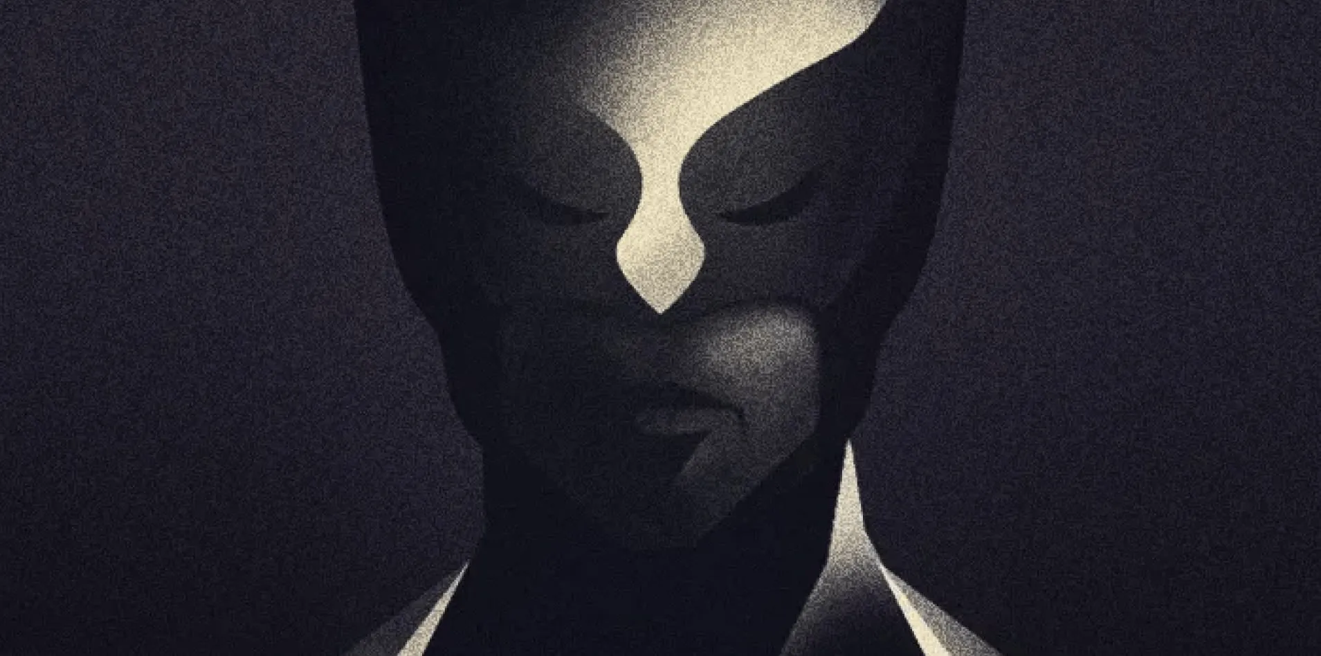
Fair warning: this is more of a guide than a step-by-step tutorial, so beginners might get a little lost along the way. The style I was chasing is based on this Batman poster of his.
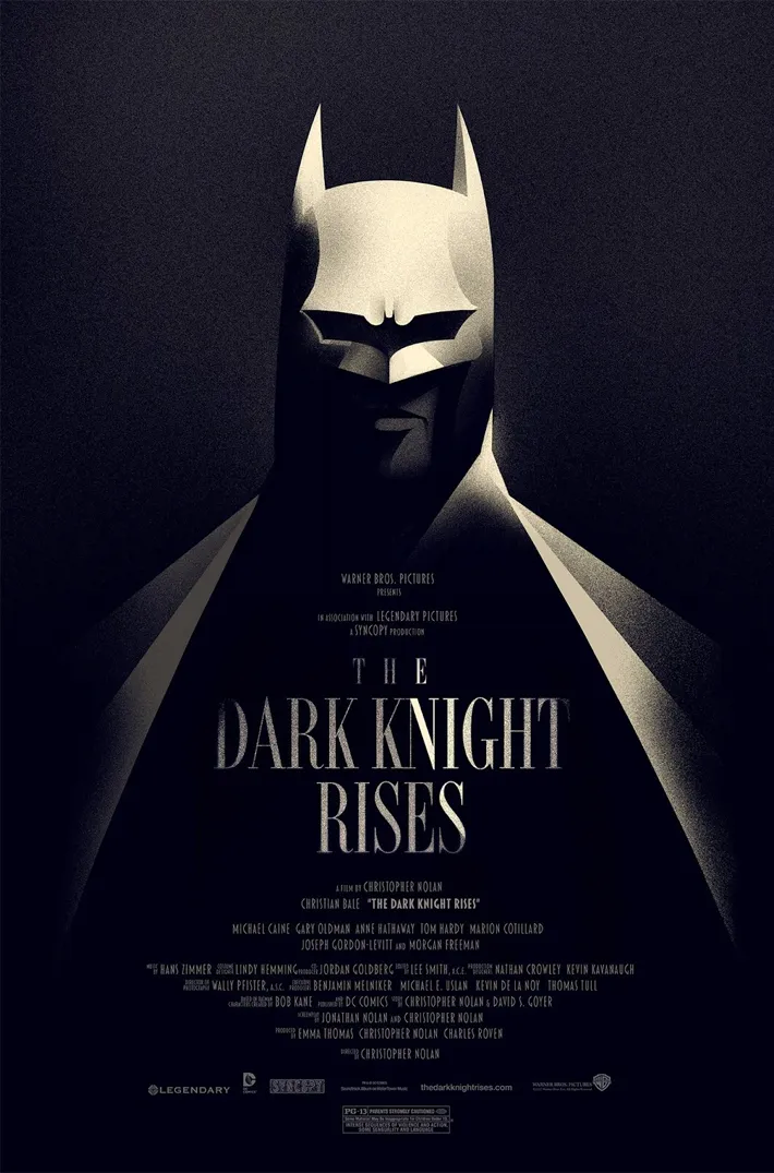
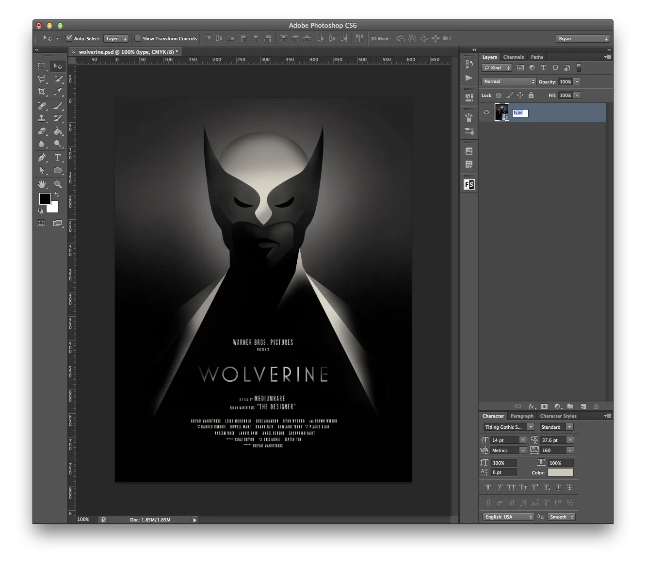
Apart from the illustration itself, the rest of the effect is fairly simple — a limited color palette, some noise for texture, and what looks like a gradient map tying it all together. Here’s what my end result looked like:
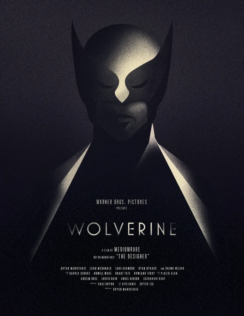
Let’s get started.
Create a new Photoshop document at 800×1035px and set the background to black.
Next, sketch out a simple figure to illustrate. I’m no illustrator, so I referenced some Google image searches and put together something reasonably simple for Wolverine. You can do this step in Photoshop or Illustrator — I used Illustrator, though in hindsight I wouldn’t recommend it, since editing paths later is much easier directly in Photoshop. The main thing is to keep your color palette tight: I used only two colors here, #bab5aa and #dad4c8.
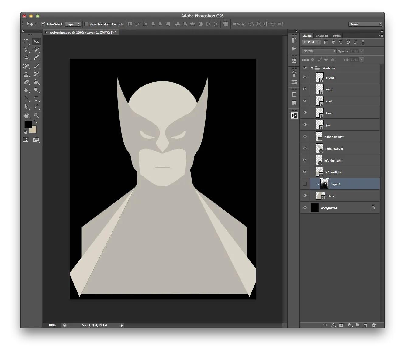
From there, go a little wild with masks to hide parts of the illustration. I referenced the original Batman image and worked from the bottom up with a large, soft round brush.
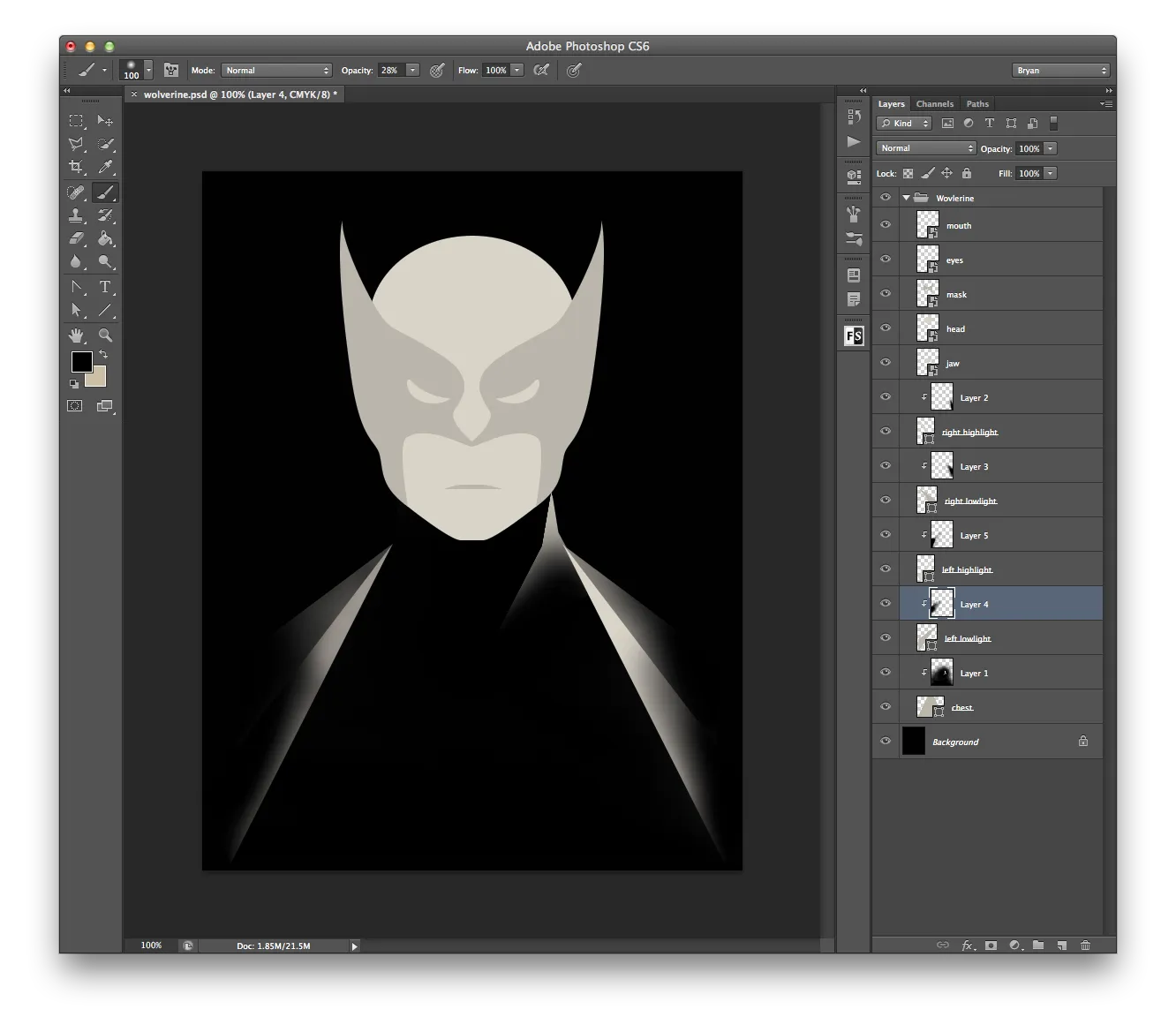
Once you reach the head, keep masking out detail. I felt the mask needed more definition, so I used the pen tool to draw in some contour lines while masking, and painted a soft glow behind the head with a large brush just to see what I was doing.
Next, drop the brush size down and start painting in the areas that would be casting shadow under the mask.
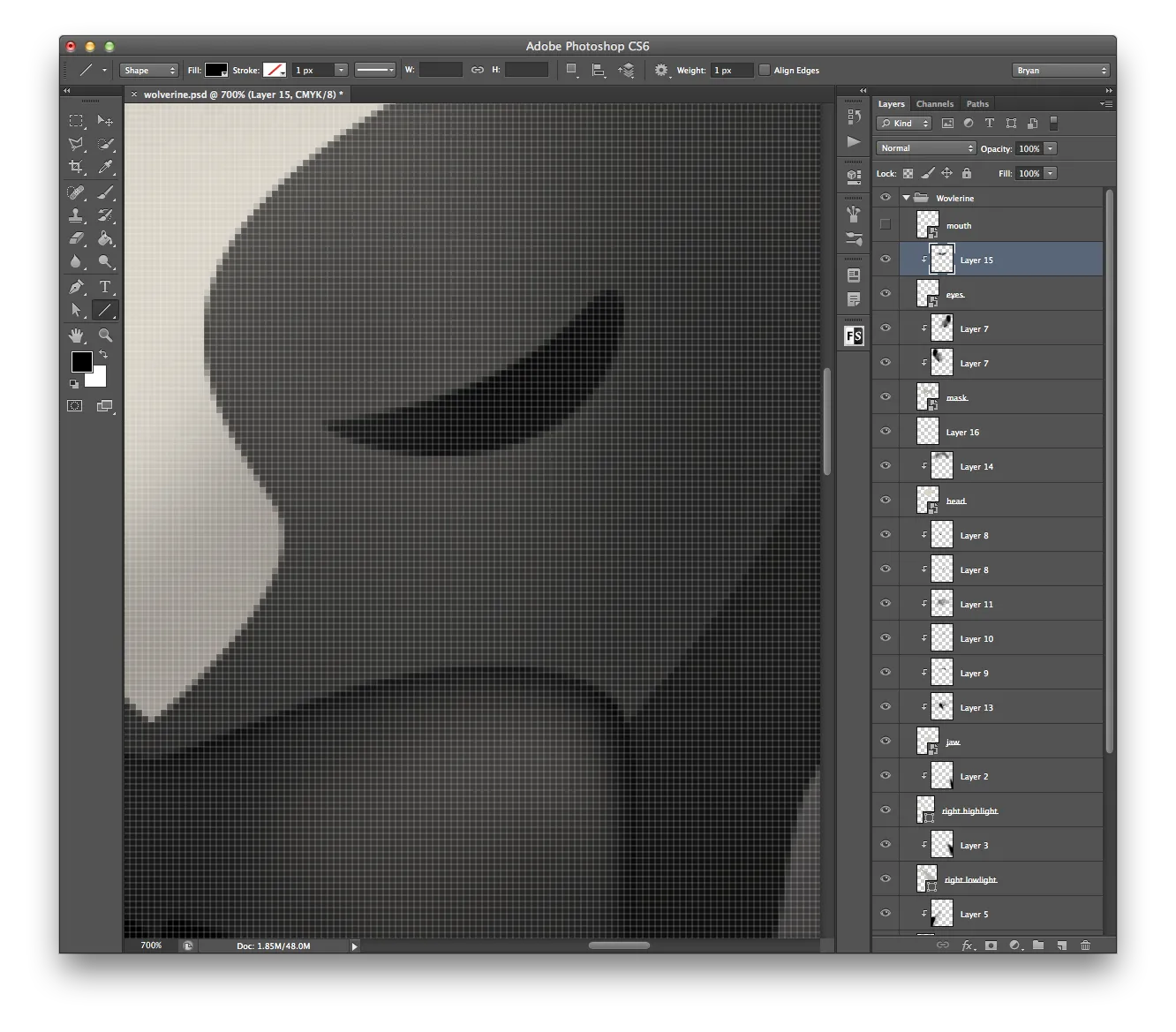
Once you’ve brushed in your semi-final details, convert all the layers into a smart object — it keeps the document tidy and makes it much easier to go back and make small edits later.
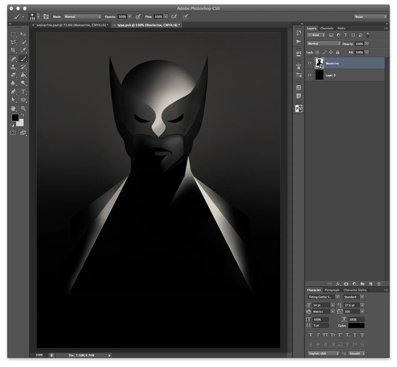
Now it’s time for the type. Inside the smart object, pair a condensed font for the smaller text with something more contrasting for the movie title. Once the type’s in, mask it the same way you masked the illustration. When you’re happy with it, exit the smart object so you can start layering on effects.
First, add some noise to the smart object (Filter > Noise > Add Noise). Because it’s applied to a smart object, the settings stay fully editable afterward, so don’t worry too much about getting them exactly right the first time.
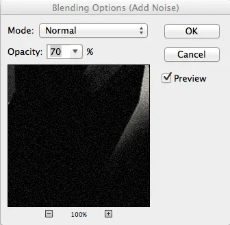
The amount of noise on its own is a bit much, so to tone it down, double-click the filter’s blending options and bring the opacity down to about 70%.
Next, add a gradient map to shift the color tone — a simple left-to-right gradient using #121017 and #dec999, masked out over the bottom section so the type still pops. At this stage I actually made the eyes lighter instead of darker, thinking it needed more contrast, but ended up reverting that in the final version.
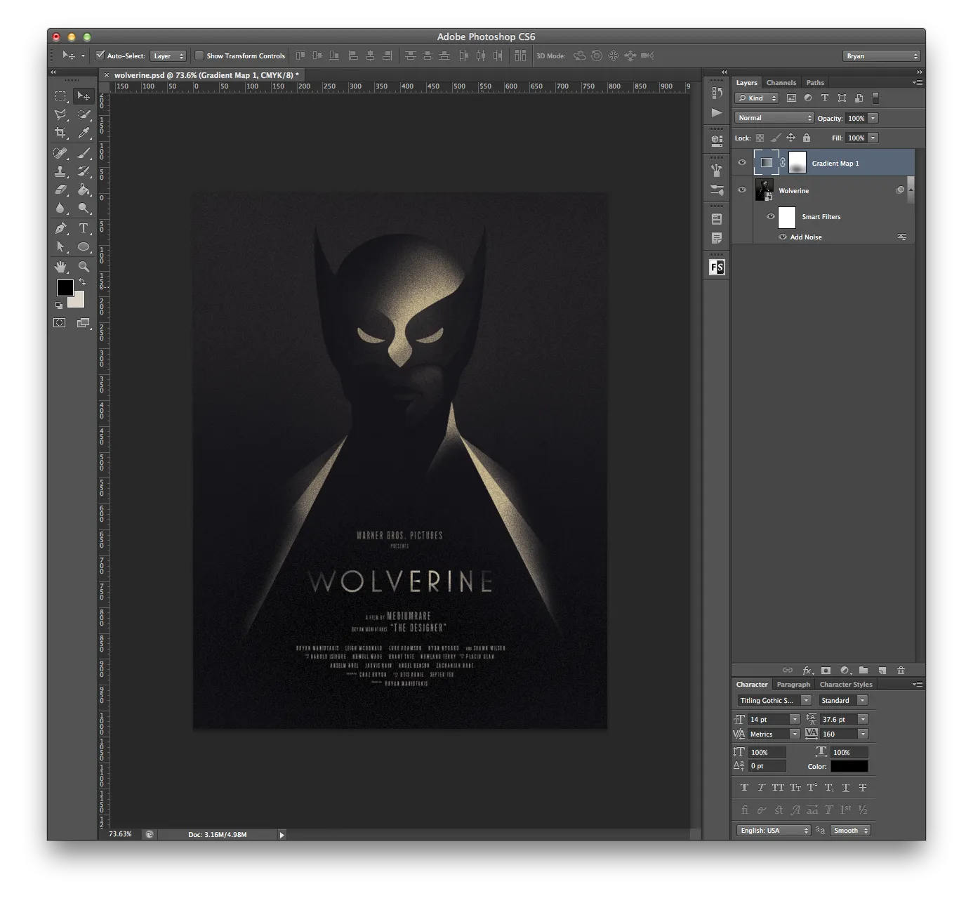
That’ll leave things looking a bit dull, so add a Brightness/Contrast adjustment layer and push it up until it feels right.
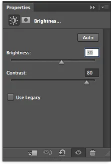
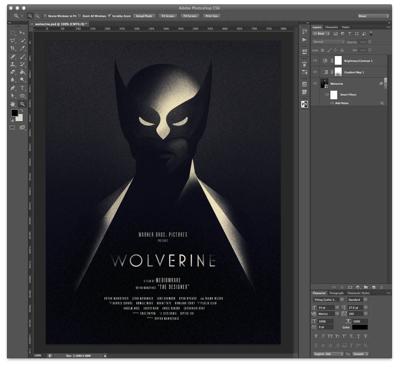
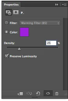
It’ll probably still read a touch dark — add a Levels adjustment layer and nudge the white slider in slightly. The original poster leans a bit more purple than what we’ve got at this point, and rather than fight with the gradient map layer, the easiest fix is a purple (#a01fdc) photo filter dropped to around 25% opacity. To keep the yellow tones from getting muddy, mask the lighter areas of the photo filter with a soft brush. Finish it off with a very slight vignette to frame the image.
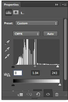
There you have it!
Edit: after some discussion on Twitter, Olly clarified his actual process — he meant setting the brush tool to “Dissolve,” not “Diffuse.” Updated above.